Event Analytics Dashboard
Default ThreatQ Role: Administrative, Maintenance, or Primary Contributor
Custom Role:
- Action Permissions: Objects & Context - Objects (all object types) OR Data Access Permissions: Event
- Action Permissions: Artifact Management - Dashboards
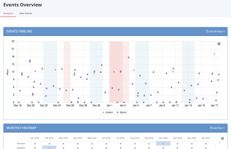
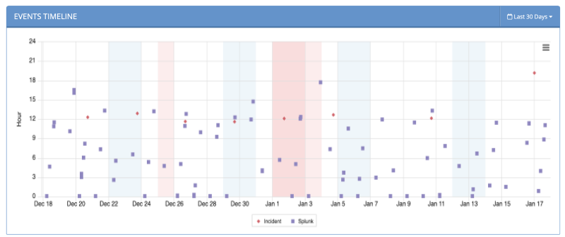
The Event Analytics dashboard provides a high-level view of what types of Events have occurred and how frequently they are occurring.

Events History Scatter Plot
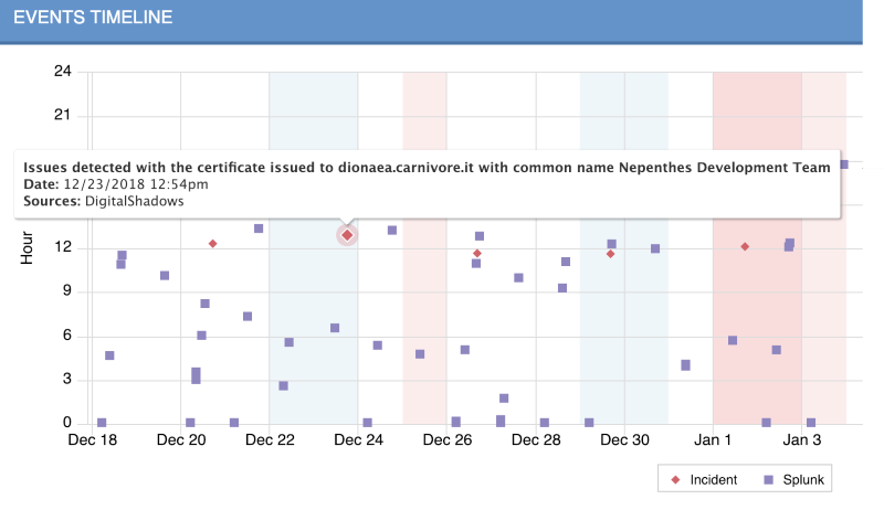
The scatter plot points are plotted by date (x-axis) and hour (y-axis). The legend under the scatter plot identifies the different kinds of events shown.

The following functions are available:
| Function | Details |
|---|---|
| Viewing an event’s name, date and time, and source | Hover your mouse over an event on the scatter plot to see its name, date and time, and source.
|
| Opening the Event Details page for one of the events | Click the event in the scatter plot.
For more information, see About Object Details. |
| Hiding or unhiding one or more of the event types | Click the event type in the legend immediately below the scatter plot to remove it from the graph; click it again to reinstate it. |
| Adjusting the time frame of the information displayed | Click the dropdown menu at the top right and select the desired time frame.
You can select from:
|
| Printing or downloading the scatter plot as a PNG, JPEG, PDF, or SVG file |
|
Events Heatmap
The Events Heatmap table lists events by adversary. Shading of the totals is used to allow you to quickly scan for patterns in the events and to quickly detect events with higher counts.

The following functions are available:
| Function | Details |
|---|---|
| Viewing an event’s name and monthly count |
|
| Adjusting the time frame of the information displayed |
|
| Printing the graph or saving it as a PNG, JPEG, PDF, or SVG |
|
